I’ve been away from this project for over a month now. As you might have noticed, I ended up taking a little bit of a hiatus as the world got a bit scary ever since1. Still, here we are, learning how to get to the other side of this together.
This past month I avoided jumping into code after work and enjoyed some time away from the screen — mostly reading Frank Herbert’s Dune. I think I’m getting the hang of the quarantine now and feel more comfortable to slowly get back to this website.
I wanted to talk about some of the main layout bricks used here as well as how I’m structuring the bits of code that make them.
Type scales
Most styling frameworks today — Gatsby’s standard included — have pretty decent type scales. This considering the fact I’m not the type of designer that normally pushes for HUGE fonts but also care about accessibility enough to avoid a 8pt body text. For a project like this, using all styles from h1 to h6 plus paragraph seems a bit of an overkill. I won’t be using these many styles and think 4 or 5 might be more than enough for now.
For the font-size at HTML level I am using Gatsby’s default of 112.5%/1.45em (18px instead of the browser’s default of 16px). And then for each text tag I’m using rem units. I have completely discarded h6 and will try to not use h2 either which leaves me with 4 title styles and one for paragraphs.
After some minor letter-spacing adjustments, here’s what I got.
h1
|
This is a title text |
h3
|
This is a h3 text |
h4
|
This is a h4 text |
p
|
This is a body text |
h5
|
This is a label text |
As I’m using markdown to write 99.99% of this website, I decided h4 will have the same size as p with just a different weight and color, giving me more flexibility to play with stiles when writing.
Variables
For now I’m using mostly colour variables but this will likely expand in the future to spacing too.
Background colour
--bg-lightest
--bg-light
--bg-mid
--bg-dark
--bg-darkest
Accents
--primary
--accent
Font colour
Light and dark
In the future this site will support different colour themes — but if you know how to inspect code in you can already see it in action by adding data-theme="dark" inside the <html> tag.
[data-theme="default"] {
  --bg-lightest: #fff;
  --bg-light: #f7f7f7;
  --bg-mid: #e2e2e2;
  --bg-dark: #dbdbdb;
  --bg-darkest: #d1d1d1;
  --bg-frosted: #ffffffe8;
  --font-high-contrast: #000000ed;
  --font-mid-contrast: #000000ad;
  --font-low-contrast: #0000004f;
  --font-inactive: #cecece;
  --accent: #ffeb82;
  --primary: #2f80ed;
  --primary-bg: #2f80ed12;
  --bg-code: #dcf5ff;
  --code: #ffe2f1;
}
[data-theme="dark"] {
  --bg-lightest: #222222;
  --bg-light: #1e1e1e;
  --bg-mid: #181818;
  --bg-dark: #131313;
  --bg-darkest: #0a0a0a;
  --bg-frosted: #323232de;
  --font-high-contrast: #fffffff7;
  --font-mid-contrast: #ffffffb8;
  --font-low-contrast: #ffffff4d;
  --font-inactive: #3f3f3f;
  --accent: #00877b;
  --primary: #ffcec3;
  --primary-bg: #ffcec312;
  --bg-code: #00877b;
  --code: #fff;
}
Go ahead, inspect and add data-theme=“dark” to the html tag ;)
Grid and page body
Oh, grids. This is going to be an unpopular opinion. For the past couple of years I’ve been designing mostly for mobile and my process has involved very little — if any — use of grids. While many of my friends are skeptical about this opinion, grids for me have a similar importance to setting the table for dinner.
Setting the table is an important part of the dinner ritual, and you could spend hours making it perfect — aligning silver and dishes, matching table cloth and napkins — but table setting isn’t anyone’s final goal (I think). I’m a fan of simpler table arrangements that succed at placing the meal under the spotlight.
Here I’m using a single column layout where, every now and then, an element will break the vertical monolyth — without a pre-determined grid, of course.
Truth be told: if you know the basics of CSS, a project like this doesn’t require a grid and can make good use of more automatic layout rules (flexbox’s justify-content is a good example of that).
As mentioned before, I’m challenging myself to build this without any @media in my code, meaning the same lines of style should work across different sizes of devices. For the body of text, I’m using a simple max-width: 60rem.
Markdown and frontmatter
I’m using Markdown to write every page in this website except for the home. Making Markdown powerful is a critical part for the success and speed of posting new work so I’m writing the React template in a way that will allow me to control things such as background colour for an icon or images all via frontmatter.
Blog posts and case studies
The main structure you see here should work for both case studies and blog posts. I’m writing the same React template and adding only a few lines of conditionals that will help only display the field if the content exists in the markdown file.
Sneak peak: “Doing”
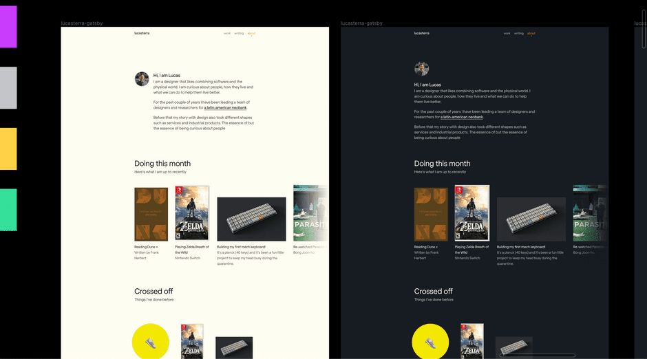
I am now working on the about me page and exploring ways to show what I am doing during the quarantine. The idea still needs to mature — and I don’t want to make it a side project within a side project. For now I’ll just leave you with this.

-
In case you’re reading this from the future, I’m writing during the COVID-19 pandemic.
↩